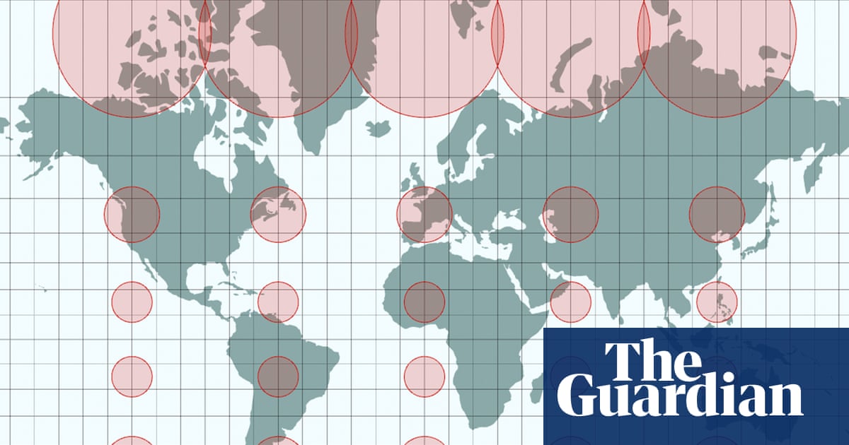
Three cartographers have spoken of their astonishment at the UN’s near-universal adoption of a map they created to more accurately show the sizes of Africa and Europe, even though they have received a few complaints from some disgruntled diplomats. The creators of the Equal Earth projection aimed to provide an alternative to the dominant 16th-century Mercator display, which critics have long faulted for giving the impression that northern hemisphere nations are larger than they are – and therefore subtly reinforcing perceptions of where global strength lies. The UN general assembly voted this month to adopt the new map, which more accurately represents the sizes of all continents, particularly Africa.
It is hoped the projection will gradually replace Mercator on school walls and government websites. Put forward by Togo, the proposal was hugely successful, with 164 countries voting in favour. The only “no” vote came from the US, whose UN representative, Yaryna Ferencevych, said resolutions such as the “correct the map” effort were “barnacles on our work here”.
The US is one of the countries that appears smaller on the new projection. It also makes Greenland – a territorial prize Donald Trump has openly coveted as a “big beautiful piece of ice” – seem significantly less dominant. Six other nations abstained from the vote, and Patterson said he had been contacted by diplomats from government embassies in Washington DC looking for clarification.
Japan asked for a revision because it said the map made the disputed Kuril Islands appear to belong to Russia by putting them in the same shade of yellow. Ukraine also abstained, as Russian-occupied Crimea was a different colour to the rest of the country. Ukraine’s representatives at the UN said this opened a “Pandora’s box” and violated international law.
The cartographers see these objections as stemming from something of a misunderstanding. The map voted on at the UN is simply a mathematical projection of the land and sea, without human-made borders or shading. The confusion arose due to a website run by Patterson that offers free Equal Earth projections.
He had annotated these with geopolitical lines and the names of countries, and has been rushing this week to update them, including switching colours and changing spellings, such as Turkey to Türkiye. Patterson developed the new projection in 2018 with a California-based software engineer, Bojan Šavrič, the “maths wizard” of the trio, and Bernhard Jenny, an associate professor at Monash University in Melbourne, Australia. Jenny said people generally believed maps were accurate representations of the Earth, but that logic breaks down because we live on a curved surface.
Extract — continue reading at the source.


